Wise Church WordPress Theme Documentation

Wise Church is the wisest multi-purpose church WordPress theme. It is unique, lightweight, rock-solid and blazing fast to meet your church needs.
The following document is a detailed user guide to help you get your new website up and running. Please take your time, and read through the document comprehensively and earnestly. If you require further assistance, you can reach us through our support page.
Subscribe to our YouTube Channel for more video tutorials.
Theme Name: Wise Church
Version: 3.4
Author: Probewise
Author URL: www.probewise.com

1. General Knowledge

1.1 Introduction

Welcome to Wise Church WordPress Theme Documentation! Here, you'll find a detailed documentation to get your website supercharge with useful features. Before you begin, consider the resources below that will introduce you to WordPress and to this theme.

WordPress Information

Wise Church WordPress Theme

  • What is Wise Church, and why you should choose it? - Presentation
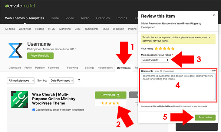
  • Where to purchase Wise Church? - Purchase
  • How do I get supported with Wise Church? - Privilege
Are you ready to install and launch your WordPress site using Wise Church theme? Let's get started.

1.2 Requirements

This section covers the recommended configuration for the theme which works under a typical installation. Like what the theme is created for, it is light and fast but its speed also varies according the hardware performance of your server, number of site visitors, number of plugins you have installed, etc.
Server Requirements
  • WordPress 5.7+
  • Apache or Nginx
  • PHP version 7+
  • phpMyAdmin version 4.6+
  • MySQL or Mariadb version 5.5+
Web Hosting Requirements
Choosing the right web hosting provider is a bit confusing to some. But if several factors are considered, like bandwidth which refers to speed, SSD storage for fast loading, uptime for reliabilty, pricing, and support, you can attain the best performance for your site. To help you out in choosing the right web hosting server, here's a list of our recommended web hosting.
Plugins
Previously, there are plugins embedded with this theme. With the recent release, as we comply with WordPress coding requirements, plugins are now separated, but it is automated when installing. Here's the list of required and recommended plugins for the theme:
Required Plugins
These are the required plugins that should be installed. Without this, theme's advanced features won't be activated.
Recommended Plugins
These are the recommended plugins that is optional to install. Some of it like Customizer Export/Import, Widget Importer & Exporter are necessary for configuration backup.
  • Autoptimize - optimize site's speed by style, script and HTML minification and other optimization *free
  • WP Super Cache - optimize site's speed by using cache features *free
  • Contact Form 7 - a plugin to create a contact form page *free
  • Slider Revolution - a premium slider plugin for WordPress *bundled for sample purposes, buy license to obtain support from plugin author
  • Screets Live Chat - a plugin to support your visitors through live chat *bundled for sample purposes, buy license to obtain support from plugin author
  • Give Donation Plugin - a plugin to create and monitor donations (needed if you accept donations) *free, for advanced features visit GiveWP Addons
  • bbPress - a plugin to create forums for your site (needed if you want to run a forum) *free
  • WooCommerce - an ecommerce plugin to sell your stuff (needed if you are selling) *free
  • Google XML Sitemaps - a plugin to create an XML sitemap for site indexing *free
  • The SEO Framework - a bloat-free SEO plugin to boost your SEO *free
  • Stop Spammers - prevents spammers and unauthorized login attempts for your site *free
  • Customizer Export/Import - import or export customizer settings *free
  • Widget Importer & Exporter - import or export widget settings *free
  • One Click Demo Import - import demo contents in just a click from default demo site *free
To speed up your site more, you can use a Content Delivery Network (CDN) like Cloud Flare.
To check your site speed you can try one of the speed test tool below:

2. Installation

2.1 Install and activate a theme

Installing a WordPress theme can be done using two methods, via WordPress dashboard or via FTP (File Transfer Protocol) Client.
To install the theme, please refer to our blog article, How to Install and Activate a WordPress Theme.

2.2 Install Plugins

Installing a WordPress plugin can be done in simple steps. Commonly if it is free, you can browse through plugin page of the WordPress repository, upload it manually (especially for premium from external sources) or install it automatically, like on this theme with an embedded TGMPA. To install a plugin, please refer to our blog article, How to Install Plugin for WordPress. This theme's required and recommended plugins are listed here.

On the recent release of the theme from version 2.8, installation of plugins is automated. In just a few clicks, required and recommended plugins are installed and activated. To install plugins automatically, follow the instructions below.
    install-plugins
  1. Go to Appearance Install Plugins.
  2. Choose and click Install to install a plugin. For bulk installation, check each plugins. Select Install from Bulk Actions near the Apply button, then click Apply.
  3. You can also activate the installed plugin in bulk by navigating to To Install at the top of Apply button. For bulk activation, check each plugins. Select Activate from Bulk Actions near the Apply button, then click Apply.
Note: Required plugins should be installed otherwise theme's important features won't work.

2.3 Updating a theme

After a valid purchase, you are eligible to update your theme using your license to generate API key to be used in Envato Market WordPress Plugin. You can also manually download the theme file to your ThemeForest dashboard and upload it manually to your WordPress site. To update your theme, please refer to our blog article, How to Update WordPress Themes.

Note: If you are updating a theme, you should always backup your theme settings, contents, and especially widgets to avoid losing your setup and contents (See 3.15 Backup Customizer Settings and Contents).

3. General Configuration

3.1 Changing Site Images

Site images are very important for your site to display your brand. With this theme, you can dynamically change its default images using two methods which is the image replacement method and the upload method. This theme also supports retina display. You can upload images by adding an image on the same file path with "@2x" at the end of its filename (for example, your image name is image.jpg, add another copy of it with higher quality, preferably twice its resolution, and rename it to image@2x.jpg). To start replacing site images, follow the instructions below.
Method 1: The Upload Method
This method uses WordPress upload process. All you need to do is to upload, browse (you can drag images as well) and save. To change your site images, follow the instructions below. upload-images
  1. Click Select image button. An image lightbox will appear where you can upload or choose image on Media Library tab.
  2. To upload an image, click Select Files button, then choose an image to be uploaded. You can also drag and drop the image.
  3. After uploading an image, click Choose image button.
  4. To save settings, click Publish button.
Note: Retina settings will only appear after uploading and choosing a standard image.
Method 2: The Image Replacement Method
This method is just simple to do, but please be reminded that this overrides the default images on your parent theme and if you want to update the theme, the img directory should be backed up first.
  1. From your purchased theme directory which includes psd+logo+default_images, modify images using a photo editor like Adobe Photoshop and save it to all_images folder.
  2. Copy all modified images, then navigate to img directory of the theme.
  3. Paste the copied modified images to replace the default images.

3.2 Creating Menus

WordPress menus is one of WordPress essential features. Generally, menus are created for navigation. This theme uses menus which includes Primary Menu, Secondary Menu, Sitelinks First Column, Sitelinks Second Column, Footer Menu, bbPress Menu and WooCommerce menu. To create menus, please refer to our blog article, How to Create WordPress Navigation Menu.

3.3 Creating Homepage

Prior to the update of the theme to comply with the latest standard of WordPress and using native features from it, Gutenberg blocks are now used to build a homepage instead of widgets. To start creating your homepage, follow the instructions below.
  1. Create a new page from Pages Add New, then add a title like for example, Homepage.
  2. create-page
  3. Choose page template Page Empty under Page Attributes on the bottom right corner of the editor.
  4. page-empty
  5. Click the + sign on the content editor, then click Browse all button.
  6. Scroll to Wise Blocks categories.
  7. add-blocks
  8. Choose Gutenberg blocks, and add as much as you need. Here's the list of wise blocks to choose from:
    • Wise Featured Contents Block: displays featured contents by posts, events, sermons or products block-featured
      • Custom Block ID - custom ID for this block instead of automated ID
      • Featured Content Title - title of featured content block, if left blank default title will show
      • Disable Featured Content Title - check to disable featured content block title
      • Posts ID - use this if you want to manually add featured content by ID, leave blank to automate (using Set as Featured button on each posts, events, sermons)
      • Note: For more instructions on how to add featured contents, please refer to 3.7 Add Featured Contents.
      • Order by - order featured contents by date, random, title, comment
      • No. of Featured Posts - set the no. of featured posts to display on frontend
      • Slider Speed in Seconds - set slider speed in seconds, leave blank for defaults (5 seconds)
      • Background Image - add background image for the block layout with parallax effect
      • Opacity - set opacity from 0% to 100%
      • Animation - add animation when the page is scrolled
      Note: If you are translating the theme, you should leave the title or any translatable text/textarea blank. There's no need to input the title/text on the field as long as you are using the translated file from .pot file provided on this theme.
    • Wise Tab Layout Block: displays four posts tab by categories and an event sidebar for easy access block-tab
      • Custom Block ID - custom ID for this block instead of automated ID
      • Tab Layout Block Title - title of layout block tab, if left blank default title will show
      • Disable Tab Layout Block Title - check to disable layout block title
      • Tab Title - title of the tab, if left blank default title will show
      • Tab Category - choose a category of posts to display on the first tab
      • Tab Block Type - choose block type from Default, Grid, Grid (Title Only)
      • Tab No. of Posts - set the no. of posts to display on frontend
      • Tab More URL - change More button URL
      • Disable Tab - check to completely disable a tab section
      • Upcoming Events Title - title of the upcoming events post type
      • Disable Upcoming Events Title - check to disable upcoming events title
      • No. of Events - set the no. of events to display on frontend
      • Background Image - add background image for the block layout with parallax effect
      • Opacity - set opacity from 0% to 100%
      • Block Title Animation - add animation to the block title when the page is scrolled
      • Left Column Animation - add animation to the left element of the block when the page is scrolled
      • Right Column Animation - add animation to the right element of the block when the page is scrolled
      Note: If you are translating the theme, you should leave the title or any translatable text/textarea blank. There's no need to input the title/text on the field as long as you are using the translated file from .pot file provided on this theme.
    • Wise Live Countdown Block: displays live streaming countdown timer block-countdown
      • Custom Block ID - custom ID for this block instead of automated ID
      • Live Streaming Title - title of live streaming countdown block, if left blank default title will show
      • Disable Live Streaming Title - check to disable live streaming title
      • Manual Next Event Timer - for manual timer, time format should be: January 01, 2024 24:00:00
      • Automatic Next Event Timer - automatic timer based on each event pages with a category slug: live-stream
      • Disable Top Padding - removes top padding of live streaming widget
      • Disable Bottom Padding - removes bottom padding of live streaming widget
      • Opacity - set opacity from 0% to 100%
      • Animation - add animation when the page is scrolled
    • Wise Map Location Block: displays the church map location block-map
      • Custom Block ID - custom ID for this block instead of automated ID
      • Location - the complete address of the church, press search then move the marker to the desired position
      • Map Type - set map type, Road Map, Satellite, Hybrid, Terrain
      • Custom Maps Marker - upload an image to change the default map marker
        (format: PNG, ICO, SVG, size: 64x64px or 32x32px)
      • Animation - add animation when the page is scrolled
      Note: If Google Maps API is not configured, maps will not appear on frontend and backend. To configure maps API, please refer to 3.13 Add Google Maps API Key. Map zoom in frontend adjusts based on its backend zoom.
    • Wise Profile Message Block: displays a few description or message and an image of a person block-our-pastor
      • Custom Block ID - custom ID for this block instead of automated ID
      • Profile Name - add person's full name, if left blank default name will show
      • Profile Title - the title of the person, for example, "Senior Pastor", if left blank default title will show
      • Disable Profile Title - check to disable person's title
      • Message - add message, description or verse(s) from the person, if left blank default message will show
      • Button Name - change button name for person's profile link, if left blank default button name will show
      • Disable Button - check to disable person's profile URL button
      • Profile URL - URL link to person's profile
      • Profile Image - upload or add URL image link of the person
      • HTML5 Video MP4 - add URL or upload .mp4 video format for video background
      • HTML5 Video OGG - add URL or upload .ogg video format for video background
      • Background Color - change background color using color picker
      • Enable Text Shadow - add shadow effect to the text if enabled
      • Background Image - add background image for the block layout with parallax effect
      • Opacity - set opacity from 0% to 100%
      • Left Column Animation - add animation to the left element of the block when the page is scrolled
      • Right Column Animation - add animation to the right element of the block when the page is scrolled
      Note: Please use a square dimension of the profile image, like for example, 730x730px size. For best result on video background, add 4:3 or 16:9 ratio format with .mp4 extension. You may opt to use a maximum 720p video format with lower bitrate to load your site faster.
      Remember: Speed of video background may vary according to your video file and web hosting performance. If you would upload a video to your WordPress dashboard by default, it only limits an upload size of 2MB. If you want to increase upload limit, please contact your hosting company.

      If you are translating the theme, you should leave the title or any translatable text/textarea blank. There's no need to input the title/text on the field as long as you are using the translated file from .pot file provided on this theme.
    • Wise Sermon Grid Block: displays sermon block in grid format block-sermon
      • Custom Block ID - custom ID for this block instead of automated ID
      • Sermon Block Title - title of sermon block, if left blank default title will show
      • Disable Sermon Block Title - check to disable sermon block title
      • Background Image - add background image for the block layout with parallax effect
      • Opacity - set opacity from 0% to 100%
      • Animation - add animation when the page is scrolled
      Note: If you are translating the theme, you should leave the title or any translatable text/textarea blank. There's no need to input the title/text on the field as long as you are using the translated file from .pot file provided on this theme.
    • Wise Subscribe Email Block: displays subscribe email and its description block-subscribe
      • Custom Block ID - custom ID for this block instead of automated ID
      • Subscribe Email Description - add description about subscription, if left blank default description will show
      • Subscribe Email URL - add URL link of the subscription link
      • Note: For a detailed guide using MailChimp, please refer to 3.11 Add Contact Form Page and Subscribe Form.
      • Background Color - change background color using color picker
      • Opacity - set opacity from 0% to 100%
      • Animation - add animation when the page is scrolled
    • Wise Triple Description Block: displays first three impression of the site with icons/images and links block-description
      • Custom Block ID - custom ID for this block instead of automated ID
      • Icon - add font icon using Fontawesome, you can also add an image, for Fontawesome icons, you should use Text mode and not Visual mode in the editor

        Sample image tag
        <img src="http://www.yourimageurl.com/yourimage.jpg">
        Sample Fontawesome icon tag
        <i class="fa fa-clock-o" aria-hidden="true"></i>
        Note: For more font icons, visit Fontawesome.
      • Title - title of a single item block, if left blank default title will show
      • Link Name - name for the link of the item block, if left blank default link name will show
      • Link URL - URL for the link of the item block
      • Disable Link - check to disable a single link
      • Background Image - add background image for the block layout with parallax effect
      • Opacity - set opacity from 0% to 100%
      • Animation - add animation when the page is scrolled
      Note: Triple Description block consists of three item content, so add each item a title and description, but you can opt to leave link name and link URL if you don't need it.

      If you are translating the theme, you should leave the title or any translatable text/textarea blank. There's no need to input the title/text on the field as long as you are using the translated file from .pot file provided on this theme.
    • Wise Welcome Message Block: displays welcome message with arrow to smooth scroll on the chosen block block-message
      • Custom Block ID - custom ID for this block instead of automated ID
      • Welcome Initials - the initial letter of your church name, you can also use a word, if left blank default initial will show
      • Disable Welcome Initials - check to disable welcome initials
      • Welcome Title - the title of welcome message block, welcome greetings, if left blank default title will show
      • Disable Welcome Title - check to disable welcome title
      • Welcome Message - description of welcome message block, write a short description about your church, if left blank default message will show
      • Disable Welcome Message - check to disable welcome message
      • Add an ID name - a smooth scroll arrow to navigate to specific block (choices are listed below), leave blank to disable
        • wise-items-(custom ID) - Wise Triple Description Block
        • wise-carousel-(custom ID) - Wise Featured Content Block
        • wise-live-(custom ID) - Wise Live Countdown Block
        • wise-sermon-(custom ID) - Wise Sermon Grid Block
        • wise-tab-(custom ID) - Wise Layout Tab Block
        • wise-our-pastor-(custom ID) - Wise Profile Message Block
        • wise-subscribe-(custom ID) - Wise Subscribe Email Block
        • wise-watch-live-(custom ID) - Wise Watch Live Block
        Note: ID should have a *suffix from custom ID, for example you set Subscribe Email Block Custom ID as 1234,
        wise-subscribe-1234 should be placed on Add an ID name.
      • HTML5 Video MP4 - add URL or upload .mp4 video format for video background
      • HTML5 Video OGG - add URL or upload .ogg video format for video background
      • Background Color - change background color using color picker
      • Enable Text Shadow - add shadow effect to the text if enabled
      • Background Image - add background image for the block layout with parallax effect
      • Opacity - set opacity from 0% to 100%
      • Animation - add animation when the page is scrolled
      Note: For best result on video background, add 4:3 or 16:9 ratio format with .mp4 extension. You may opt to use a maximum 720p video format with lower bitrate to load your site faster.
      Remember: Speed of video background may vary according to your video file and web hosting. If you would upload a video to your WordPress dashboard by default, it only limits an upload size of 2MB. If you want to increase upload limit, please contact your hosting company.

      If you are translating the theme, you should leave the title or any translatable text/textarea blank. There's no need to input the title/text on the field as long as you are using the translated file from .pot file provided on this theme.
    • Wise Watch Live Block: displays Page Watch Live block-watch-live
      • Custom Block ID - custom ID for this block instead of automated ID
      • Watch Live Block Title - the title of Watch Live Block, if left blank and not disabled, WATCH LIVE will show
      • Disable Watch Live Block Title - disables watch Watch Live Block title
      • Live Streaming Schedule - sets live streaming schedule using WYSIWYG editor
      • Live Streaming Guide - sets live streaming guide using WYSIWYG editor
      • Manual Next Event Timer - for manual timer, time format should be: January 01, 2024 24:00:00
      • Automatic Next Event Timer - automatic timer based on each event pages with a category slug: live-stream
      • Disable Live Countdown - disables live countdown feature
      • Choose Video Server - select video server to display on Wise Watch Live Block
        • Built-in Player - uses default embedded HTML5 player
        • Facebook - uses Facebook live recent live video
        • Video Embed - uses embedded video placed on Video Embed Code textarea
      • Built-in Player Video URL - uses built-in player in .m3u8, .mpd, .mp4, .webm, .ogv format
      • Video Embed Code - if you are using external sources for live streaming, add embed code here, otherwise if you leave this blank, the theme's integrated player will be activated
      • Facebook Page ID - if you'll use Facebook Live, place Facebook page ID here, it is located at the About section of your Facebook Page
      • Facebook Access Token - if you'll use Facebook Live, an Access Token is necessary to sync data from page API that can be generated from Facebook Graph API Explorer
    • Revolution Slider Block: a block to display slider created from Slider Revolution
      To import and add a slider, please refer to 3.4 Import and Add Slider Revolution. block-slider
  9. Select sidebar for your homepage.
  10. select-sidebar
  11. Click Publish button to save settings.
  12. publish-homepage
  13. To activate your page as your frontpage/homepage, navigate to Settings Reading Front page displays.
  14. Choose A static page and select the homepage you have just created.
  15. Click Save Changes button.
  16. select-frontpage
    Note: You can also select a homepage on Customizer. Follow the instructions below.
  1. Go to Appearance Customize. customizer
  2. Select Homepage Settings, then choose A static page.
  3. Select the homepage you've just created under Homepage.
  4. Click Publish at the top right corner of Customizer panel.
  5. customizer-homepage

3.4 Import and Add Slider Revolution

  1. Install Slider Revolution. It is bundled with the theme package (/plugins/revslider.zip). For plugin installation instructions, please refer to How to Install Plugin for WordPress
  2. After installation, navigate to Slider Revolution. The plugin will work properly even if it is not activated. However, if you need support from the plugin developer, you may need to purchase a license from ThemePunch.
  3. slider-rev
  4. To import slider, click Manual box as shown in the screenshot.
  5. Download Slider Revolution template for Wise Church. You can download it here: wchurch01.zip.
  6. Browse for the directory of the Slider Revolution template you have downloaded, then click Click to Choose button or drag and drop it.
  7. A progress animated icon will appear, and it will stop and show the imported slider after a few seconds.
  8. To add the slider in the homepage, click the + sign as shown in the screenshot below.
  9. Navigate to ThemePunch, then click Slider Revolution.
  10. add-slider
  11. Click Select Module, a lightbox will appear.
  12. Select Module as shown in the screenshot below, then save your settings by clicking Publish or Update button.
  13. select-module
Note: For a complete documentation on how to create your own slider, visit Slider Revolution WordPress Documentation.

3.5 Add or Delete Widgets, Sidebar Columns

Widgets
Widgets are very important to WordPress. It can be dynamically added to sidebar/widget column. To add or delete widgets, please refer to our blog article, How to Add or Delete WordPress Widgets. This theme consists of the following widgets:
  • #Wise About - a widget for footer to display a brief summary of your site
  • #Wise CTC Custom Events - a widget to display custom events
  • #Wise Popular Sermons - a widget to display popular sermons list, it can be arranged based on posts created on this week, month, year and all time
  • #Wise CTC Recent Sermons - a widget to display recent sermons list
  • #Wise Tab Sermons - a widget to display both popular and recent sermon list
  • #Wise Dashboard User - a widget to show login/dashboard links to your site, best usage for WooCommerce or bbPress
  • #Wise Footer Sitelinks - a widget to add your site links based on your preferences
    Note: Links can be added by creating menus and assigning menus to Sitelinks Column 1 and Sitelinks Column 2. For tutorials about menus, please check out our blog article, How to Create WordPress Navigation Menu.
  • #Wise Popular Posts - a widget to list your popular posts, it can be arranged based on posts created on this week, month, year and all time
  • #Wise Recent Posts - a widget to list your recent posts
  • #Wise Script - a widget to add custom script
  • #Wise Social Media Footer - a widget to add social media links for footer
  • #Wise Subscribe Footer - a widget to display subscribe box for footer
  • #Wise Subscribe Sidebar - a widget to display subscribe box for sidebar
  • #Wise Tab Posts - a widget to add both popular and recent posts in a tab
  • #Wise Text Alert - a widget to add a custom text alert
Note: If you are translating the theme, you should leave the title or any translatable text/textarea blank. There's no need to input the title/text on the field as long as you are using the translated file from .pot file provided on this theme.
Sidebars
You can also add unlimited sidebar/widget columns for your site using pages. To add widget column, follow the instructions below. widget-column
  1. Go to WordPress dashboard and navigate to Appearance Widgets.
  2. Click Add Sidebar, a new sidebar column will then be added.
  3. Sidebar columns can be used in pages by choosing a sidebar from Select Sidebar option at the bottom of page text editor.
  4. select-sidebar

3.6 Set Featured Image for Posts

Featured image is essential in any WordPress theme. Without this, single post won't have an image thumbnail and slider carousel won't display correctly. With this theme, the optimum size to be uploaded for featured image must be 730x438 pixels. To add featured image, follow the instructions below. set-featured-image
  1. Prepare your featured image to be uploaded with a size of 730x438 pixels.
  2. In the content editor, click Set featured image located at the right bottom corner as shown in the screenshot.
  3. Click Select Files button, then browse for the image you've created.
  4. Click Select button, then a thumbnail will appear on the Featured Image section.
  5. To save your settings, click Update or Publish button.

3.7 Add Featured Contents

Featured contents are essential in every WordPress site. Using it will introduce the most important posts or articles within the site. To add featured contents, follow the simple steps below.
  1. In the Featured Contents Block, add posts IDs separated by a comma (format: 1, 2, 3) as shown in the screenshot below.
  2. featured-contents
  3. To find your post ID, click on the specific post and look for a numerical value on the URL as shown in the screenshot below.
  4. post-ID 
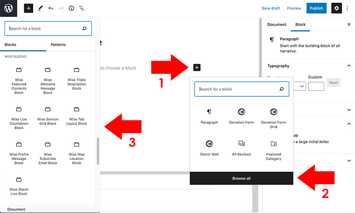
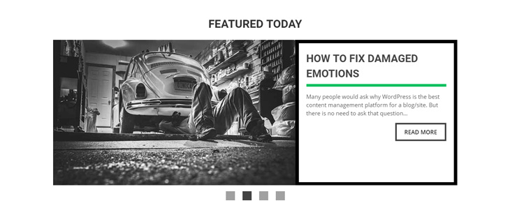
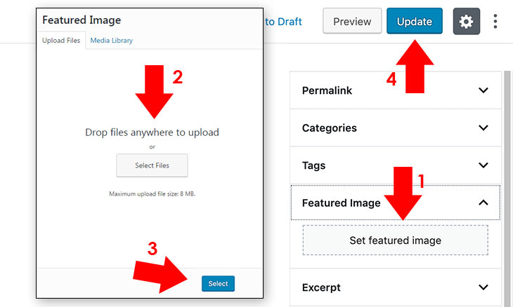
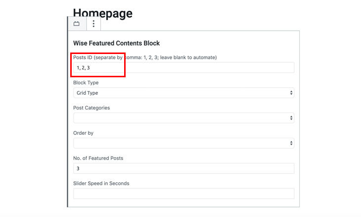
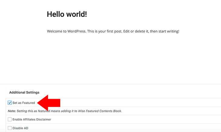
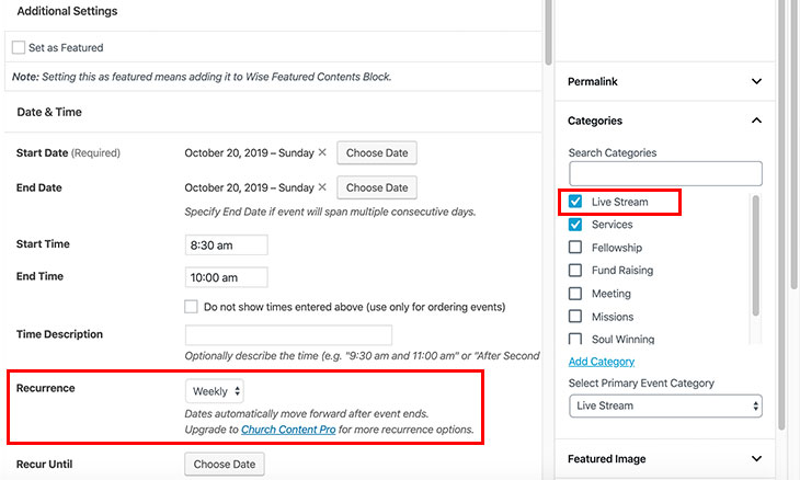
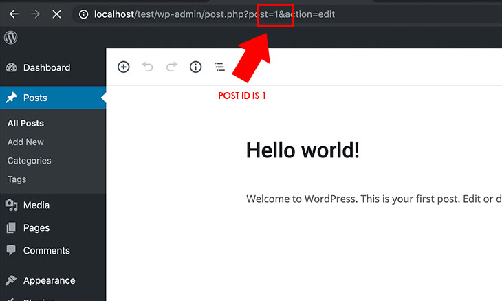
Note: If you want to automate featured contents on all categories of posts, leave the Post ID field blank, then click Set as Featured on each post you want to appear in the Featured Contents block as shown in the screenshot below. set-as-featured
  5. Click Save button to save your settings.

3.8 Changing Page Template

Custom pages is an essential feature of WordPress where you can create a page on which you can use as homepage or other usage based on your theme's functionality. To create custom pages, follow the instructions below. page-templates
  1. Go to a specific page you want to configure, or create a new page.
  2. Navigate to Page Attributes, then select the desired page template from Template option.
    This theme includes the following page templates:
    • Default Template - the default page template
    • Page Forum Topics - page template to display bbPress by topics
    • Page Forum Index - page template to display bbPress index
    • Page Single 80% - page template with single column layout (max width is 80%)
    • Page Empty - page template to be used on homepage creation
    • Page Full - page template with full column layout
    • Page Galleries - page template for galleries archive
    • Page Ministries - page template for ministries archive
    • Page Single - page template with single column layout (max width is 730px)
  3. Click Publish or Update button to save your settings.

3.9 Creating Ministries and Galleries Page

With this theme, you can add a ministries and galleries page archive by creating a category on pages and not on posts. Ministries and galleries archive is almost identical to setup. To create a ministries or galleries page, follow the instructions below.
Ministries Page
Creating a category
  1. Create a category to Page Categories. This is necessary to display galleries on Wise Tab Layout Block.
  2. Create Ministries category, then click Add New Category. You can create a different name for Ministries, but make sure its slug should only be ministries so that the category archive won't display and act only as a reference for Wise Tab Layout Block.
  3. ministries-category
Creating ministries archive (parent page)
  1. Create a new page to Pages Add New. You can set a different name aside from Church Ministries.
  2. Choose a page template of Page Ministries. For instructions in adding page templates, refer to 3.8 Changing Page Template.
  3. page-ministries
Creating ministries page
  1. To add single pages for galleries archive, create a page to Pages Add New.
  2. Check Ministries category to the page that you have created. You should always check this category everytime you add a ministries page.
  3. ministries-category-page
  4. Select Church Ministries as your parent page. You should always set this parent page everytime you add a ministries page.
  5. parent-church-ministries
  6. Choose a page template for your page, you can use Page Single, Page Single 80%, Page Full or you can even create a new sidebar column and select Default Template to add your preferred sidebar widget. For instructions in adding page templates, refer to 3.8 Changing Page Template.
  7. Click Publish to publish the page. To add another page, repeat the process in creating ministries page.
Galleries Page
Creating a category
  1. Create a category to Page Categories. This is necessary so that you can display galleries to Wise Tab Layout Block.
  2. Create Galleries category, then click Add New Category. You can create a different name for Galleries, but make sure its slug should only be galleries so that the category archive won't display and act only as a reference for Wise Tab Layout Block.
  3. galleries-category
Creating galleries archive (parent page)
  1. Create a new page to Pages Add New. You can set a different name aside from Church Galleries.
  2. Choose a page template of Page Galleries. For instructions in adding page templates, refer to 3.8 Changing Page Template.
  3. page-galleries
Creating galleries page
  1. To add single pages for galleries archive, create a page to Pages Add New.
  2. Check Galleries category to the page that you have created. You should always check this category everytime you add a galleries page.
  3. galleries-category-page
  4. Select Church Galleries as your parent page. You should always set this parent page everytime you add a galleries page.
  5. parent-church-galleries
  6. Choose a page template for your page, you can use Page Single, Page Single 80%, Page Full or you can even create a new sidebar column and select Default Template to add your preferred sidebar widget. For instructions in adding page templates, refer to 3.8 Changing Page Template.
  7. To create a gallery, click + sign as shown in the screenshots below. Navigate to Media categories, then click Gallery.
  8. galleries-add-media-block
  9. Upload or select images as shown in the screenshots below. Click Create a new gallery button, then click Insert Gallery.
  10. galleries-add-media galleries-insert-gallery
  11. On the Block Settings, select Media File under Link To, to activate image lightbox for gallery.
  12. galleries-link-media
  13. Click Publish to publish the page. To add another page, repeat the process in creating galleries page.

3.10 Posts Tweaks

This section covers posts or content tweaks which you can use for your church site.
Align blockquote to left, right or center
To align a blockquote to the left, right or center, you should add a class to it. Classes consists of alignleft, alignright and aligncenter.
<blockquote class="alignright">
	Security is a responsibility, but vulnerability is a choice. <cite>—Probewise</cite>
</blockquote>
Make embedded video responsive
By default using WordPress embed features, the video link you post is responsive. However, if you add an iframe video embed, you need to add the code below to make it responsive.
<div class="wise-container">
	Insert your video embed code here.
<div>

3.11 Add Contact Form Page and Subscribe Form

Contact Form
Contact Form 7 is one of the most popular contact form in the WordPress repository which this theme is compatible with. Adding contact form is just easy. To add contact form, please refer to our blog article, How to Add WordPress Contact Form.
Subscribe Form
This theme also supports MailChimp for subscription campaign. To add a subscribe form, please use #Wise Subscribe Sidebar or #Wise Subscribe Footer widgets. To add widgets, please refer to our blog article, How to Add or Delete WordPress Widgets.

Using the Subscribe Form Widget, you can add URL from your MailChimp account.
  1. Login to your MailChimp account.
  2. On your dashboard, click Create Signup Form. A lightbox will appear.
  3. Click Begin. It will direct you to Embedded forms.subscribe-navigate
  4. Copy the URL from <form action="URL from MailChimp"> tags as shown in the screenshot below.subscribe-form
  5. Paste the copied URL to Subscribe URL field as shown in the screenshot below.subscribe-sidebar
  6. Click Save to save your settings.
Your email newsletter subscription is now ready for campaign using MailChimp. You can opt to use Wise Script Widget if you want to embed the whole form from MailChimp or other mail campaign provider. Take note that its styling is different from the theme.

3.12 Add Donation Page

This theme uses Give Donation plugin for donation. If you want to create a donation page, please follow the instructions below.
  1. Firstly, you should install Give Donation plugin from WordPress respository. To install plugins please refer to out blog article, How to Install Plugin for WordPress. If you have already installed the plugin, skip this step.
  2. Go to WordPress dashboard and navigate to Donations Settings Display Options.
  3. Check Disable Form Single Views and Disable Form Archives, a shortcode will be used later.
  4. Click Save Settings to save changes.donation-settings
  5. Create a new donation form by navigating to Donations Add Form. Configure it according to your preferences.
  6. Click Publish button to save your setitngs and copy its shortcode.donation-form
  7. Create a new page from Pages Add New, then add the shortcode you have copied. Use Text tab from the text editor to ensure that the shortcode will work. You can also use the donation button integrated to the page to add donation form.
  8. Change page template to Page Single. For instructions, please refer to 3.8 Changing Page Template
  9. Save your newly created page. To verify that it is working, navigate the newly created page from your browser.
Note: If you want to make donation URL to work for payment, configure Payment Gateways from Donations Settings.

3.13 Add Google Maps API Key

With the new version of Church Content plugin, Google Maps are integrated to find locations easily. To enable this feature for the theme, Google API Key is required. To get an API Key, please refer to our blog article, How to Get Google Maps JavaScript API Key. To activate an API Key, follow the instructions below.
    gmaps-code
  1. Go to your WordPress dashboard and navigate to Settings Church Content.
  2. Paste the API Key to Google Maps API Key text field, then click Save Changes.

3.14 Importing Demo Contents

Adding contents to your site needs a lot of attention and takes a long time to finish. With this theme, one-click demo import makes it easy to start a site with preloaded contents. But before demo import, consider these reminders:
  • Be sure to have a fast server having a proper credentials to avoid issues. There are some instances that you cannot import demo contents due to server issues, your hosting limitations, etc., which the theme is not responsible for it.
  • You should have the latest version of the theme so that it would match the latest demo import files online.
  • You should use one click demo import from a fresh WordPress installed site to avoid duplication and other issues.
  • Maps won't connect to Google API by default. Therefore, you should set it up first or after demo import (see instruction on 3.13 Add Google Maps API Key).
  • For WooCommerce and other plugins, you need to configure some settings individually.
To import demo content, follow the instructions below.
  1. You should first install the required and recommended plugins to avoid warnings and errors. You can find the list to be installed here. Installation of plugins are also automated using TGPMA embedded on the theme. For instructions on how to install plugins, please refer to 2.2 Install Plugins.
  2. Activate the required/recommended plugins including One Click Demo Import plugin.
  3. Navigate to Appearance Import Demo Data.
  4. Click Import Demo Data and wait for a couple of minutes to finish.
  5. demo-import
  6. You may opt to deactivate demo content plugin after the import.

3.15 Backup Customizer Settings, Widgets and Contents

Backup Customizer Settings
  1. To backup/restore WordPress Customizer settings, a plugin Customizer Export/Import should be installed and activated first. For instructions on how to install plugins, please refer to 2.2 Install Plugins. You can skip this step if it is already installed and activated.
  2. Go to Appearance Customize. customizer
  3. Navigate to Export/Import, then click the Export button. It will be downloaded with a .dat extension.
  4. backup-restore-theme-settings
  5. To restore the settings, refer to steps 2 and 3, but use the import feature. Click Choose File and browse for the backup .dat customizer settings.
  6. Click Import to restore your previous settings.
Backup Widgets
Not just theme settings is needed for backup, but widget is also necessary to be backed up to avoid losing widgets positions on sidebar columns. To backup or restore widgets, please refer to our blog article, How to Avoid Losing WordPress Widgets.
Backup WordPress Contents in .xml Format
If you need to backup your WordPress site contents, WordPress has its own plugin (WordPress Importer) which exports contents in .xml format. Remember, this .xml backup is good when migrating a site to another, but media file and other attachment will not be restored if the source site is down. To include it even the source site is down, you should have an FTP backup of your site files, especially the attachment files from wp-contents uploads folder, and initially, it should be placed in the directory you want it to be restored. For .xml export and import instructions, please refer to our blog article, How to Export or Import XML WordPress Content.

3.16 Create and Configure Live Streaming Page

  1. Create a page Watch Live. You can set it to your preferred page name.
  2. Choose the page template: Page Single, you can use other page templates according to your preference. For instructions in changing custom page template, please refer to 3.8 Changing Page Template.
  3. page-watch-live
  4. Click the + sign on the content editor, then click Browse all button.
  5. Scroll to Wise Blocks categories, then choose Wise Watch Live.
  6. add-watch-live-block
  7. Configure settings according to your preference.
    • Custom Block ID - custom ID for this block instead of automated ID
    • Watch Live Block Title - the title of Watch Live Block, if left blank and not disabled, WATCH LIVE will show
    • Disable Watch Live Block Title - disables watch Watch Live Block title
    • Live Streaming Schedule - sets live streaming schedule using WYSIWYG editor
    • Live Streaming Guide - sets live streaming guide using WYSIWYG editor
    • Manual Next Event Timer - for manual timer, time format should be: January 01, 2024 24:00:00
    • Automatic Next Event Timer - automatic timer based on each event pages with a category slug: live-stream
      1. Go to Upcoming Events Add New (you can skip this step if you've already have an event added).
      2. Under Event Categories, click Add Category
      3. Add Live Stream, then click Add Category (make sure that live-stream is the slug of that category).
      4. Add details on your event, make sure its Recurrence is activated Weekly, Monthly or Yearly.
      5. Publish the page.
      6. events-settings
      Note: All events with Live Stream Category will be queued in the live streaming countdown timer if it is set as Automatic Next Event Timer.
    • Disable Live Countdown - disables live countdown feature
    • Choose Video Server - select video server to display on Wise Watch Live Block
      • Built-in Player - uses default embedded HTML5 player
      • Facebook - uses Facebook live recent live video
      • Video Embed - uses embedded video placed on Video Embed Code textarea
    • Built-in Player Video URL - uses built-in player in .m3u8, .mpd, .mp4, .webm, .ogv format
    • Video Embed Code - if you are using external sources for live streaming, add embed code here, otherwise if you leave this blank, the theme's integrated player will be activated
    • Facebook Page ID - if you'll use Facebook Live, place Facebook page ID here, it is located at the About section of your Facebook Page
    • Facebook Access Token - if you'll use Facebook Live, an Access Token is necessary to sync data from page API that can be generated from Facebook Graph API Explorer
  8. Publish/Update the page.

  9. Note: Only one server can be used to display on the block using Choose Video Server option (Built-in Player, Facebook, Video Embed).

3.17 Configure Live Chat

This theme is bundled with the one of the most popular WordPress chat plugin which is the WordPress Live Chat Plugin from Screets team. To configure WordPress Live Chat Plugin, please refer to our blog article, WordPress Live Chat Plugin Review and Guide.
Design and Styling
  1. To use theme's styling, copy and paste the CSS styling below to Live Chat Options Design Custom CSS. live-chat-styling
    /* Wise Theme Custom CSS Styling */
    .lcx .lcx-starter {
    	bottom: 8px;
    	right: 51px;
    	width: 50px;
    	height: 43px;
    	line-height: 28px;
    	background-color: #555;
    	border-radius: 0;
    	box-shadow: none;
    }
    
    .lcx.lcx--open .lcx-starter {
    	width: 50px;
    }
    
    .lcx .lcx-starter .lcx-starter-px {
    	position: relative;
    	top: 10px;
    	left: 0;
    	width: 20px;
    }
    
    .lcx .lcx-starter .lcx-starter-px:hover {
    	color: transparent;
    }
  2. To match the theme's color, change the primary and seconday color to #555555; live-chat-change-color


Note: Recent version 3 and up requires license to enable cloud connect. You may purchase a license on Screets Live Chat product page.

4. Wise Panel Settings

Wise Panel is now moved to WordPress Customizer from theme options backend. It is a default WordPress feature for faster customization of the theme. With the customizer feature, you can see a preview of your customization in realtime which is helpful in choosing the right settings for the theme. To configure Wise Panel Settings, go to Appearance Customize Wise Panel.

To reset all settings, click Reset. To save settings, click Publish. You can also backup customizer settings, including Wise Panel in .dat format. For instructions on how to backup customizer settings, please refer to Backup Customizer Settings. wise-panel

Note: Some configurations inside a setting won't show unless it's parent setting is configured. For example, choosing Image from Preloader Type will show Preloader Image upload configuration, while choosing Predefined will show predefined preloader options. And also, some settings like Security Settings won't show if Wise Contents plugin is not installed and activated. switch-options

4.1 General Settings

This section is where you can configure the theme's general settings. It includes the following sub-sections with descriptions or instructions.
  1. Preloader Type - choose Predefined or Image which will show additional configurations on the selected type
  2. Preloader Image - upload your preloader image here, it can be .gif, .png or .jpeg (maximum of 372x152 pixels), leave blank to disable preloader
  3. Predefined Preloader - choose from 12 predefined preloader which is blank-smooth(empty), rotating-plane, double-bounce, wave, wandering-cubes, pulse, chasing-dots, three-bounce, circle, cube-grid, fading-circle, folding-cube, leave blank for defaults (loading with smooth fade load), you can also change its color through Preloader Predefined Color, leave blank to disable preloader
  4. Predefined Preloader Color - choose colors for predefined preloader using color picker
  5. Background Image - upload background image in .jpeg format, it should be minimum 1460x876 pixels in size
  6. Disable Background Image - disables background image in default plain white color
  7. Disable Sticky Sidebar - disables the sticky sidebar in all posts, pages and other taxonomies
  8. Layout Style - select wide or boxed type layout
Note: For upload instructions, please refer to The Upload Method. To disable preloader, leave Preloader Image and Predefined Preloader blank.

4.2 Color Settings

This section is where you can configure the theme's color settings. You may use predefined color scheme or per categories color configuration. It includes the following sub-sections with descriptions or instructions.
  1. Predefined Colors - the predefined colors compatible with the theme, it has predefined colors which are green(default), autumnorange, mildred, darkcyan, steelblue, olive, wallnut, sienna, hotpink, neonpurple, leave blank for defaults
  2. Header Lines Color - select color for header and sticky header lines/borders
  3. Buttons Color - select color for buttons
  4. Tabs Color - select color for tabs
  5. Text and Links Color - select color for text and links
  6. Borders and Objects Color - select color for lines, borders and objects

4.3 Analytics Code Settings

This section is where you can place Analytics code and other code settings. It includes the following sub-sections with descriptions or instructions.
  1. Before head close tag - place custom code here which is displayed before the </head> tag
  2. After body tag - place custom code here which is displayed after the <body> tag
  3. Before body close tag - place custom code here which is displayed before the </body> tag

4.4 Header Settings

This section is where you can configure the theme's header settings. It includes the following sub-sections with descriptions or instructions.
  1. Header Type - select header type, Default or Simple
  2. Header Logo - upload header logo here, it should be (Default 186x76px), (Simple 240x60px)
  3. Header Logo Retina - upload header logo here, it should be (Default 372x152px), (Simple 480x120px), add @2x at the end of filename (ex. mylogo@2x.png)
  4. Sticky Header Logo - upload sticky header logo here, it should be (Default 100x41px), (Simple 152x38px)
  5. Sticky Header Logo Retina - upload header logo here, it should be (Default 200x82px), (Simple 304x76px), add @2x at the end of filename (ex. mylogo@2x.png)
  6. Custom Login Form Logo - upload login form logo here, it should be (Default 186x76px), (Simple 240x60px)
  7. Custom Login Form Logo Retina - upload login form logo, it should be (Default 372x152px), (Simple 480x120px), add @2x at the end of filename (ex. mylogo@2x.png)
  8. Header Tag Lines Title - add header tag lines title here, leave blank to show default text
  9. Disable Header Tag Lines Title - this disables header tag lines title
  10. Header Tag Lines Span - add header tag span title here, leave blank to show default text
  11. Disable Header Tag Lines Span - this disables header tag lines span
  12. Header Tag Lines Link - add URL for tag lines
  13. Header Tag Lines Link Target - choose how a link will open, in the same tab or on a new tab
  14. Disable Top Header - this disables the entire top header
  15. Contact Details or Address - add contact details here to be displayed at the header, leave blank to show default text
  16. Disable Contact Details or Address - this disables contact details/address
  17. Donation Name - add donation name other than "Donate," leave blank to show default text
  18. Donation URL - add donation URL (to setup, please refer to 3.12 Add Donation Page)
  19. Donation Link Target - choose how a link will open, in the same tab or on a new tab
  20. Disable Header Donation Button - this disables donation button on header
  21. Disable Header Shopping Cart - this disables header shopping cart icon
  22. Disable Header Social Media - this disables social media buttons on header
  23. Disable Sticky Header Social Media - this disables social media buttons on sticky header
  24. Disable Secondary Menu - this disables the secondary menu
  25. Disable Login/Register Links - this disables login/register links
  26. Disable Sticky Header - this disables the entire sticky header
  27. Header Opacity - adjusts opacity for header from 10%(.1) to 100%(1)
  28. Sticky Header Opacity - adjusts opacity for sticky header from 10%(.1) to 100%(1)
Note: For images to support retina, @2x should be added at the end of the filename, for example, mylogo@2x.png which will automatically be displayed when on retina display. For upload instructions, please refer to The Upload Method.

If you are translating the theme, you should leave the title or any translatable text/textarea blank. There's no need to input the title/text on the field as long as you are using the translated file from .pot file provided on this theme.

4.5 Archive and Content Settings

This section is where you can configure the theme's archive and content settings. It includes the following sub-sections with descriptions or instructions.
  1. Archive Posts Layout Type - select archive posts layout in Single or Grid layout type
  2. Time Format for Posts and Comments - select time format in Default or Human Readable format
  3. Disable Breadcrumbs - this disables breadcrumbs in archive, posts and other pages
  4. Disable Meta Date - this disables meta date on posts
  5. Disable Built-in Share Buttons - this disables built-in share buttons to use your preferred share buttons plugin
  6. Disable Author Info on Posts - this disables author information on all posts
  7. Disable Featured Image on Single Posts - this disables featured image on single posts
  8. Related Posts Number - add number of related posts to display on single post, leave blank for defaults, type 0 to disable it
  9. Disable Sermon Filter - removes sermon filter on the top of sermon archives
  10. Sermon Archive Layout Type - select sermon layout type grid or leave blank for default layout
  11. Sermon Archive Description - add description for sermon archive, leave blank to show default text
  12. Disable Sermon Archive Description - this disables sermon archive description
  13. Sermon Archive Posts Number - set the number of sermon to show on archive, leave blank for defaults
  14. Disable Featured Image on Sermon Single - disables featured image on sermon single post
  15. Disable Events Filter - removes sermon filter on the top of events archives
  16. Events Layout Type - select events layout type grid or leave blank for default layout
  17. Event Archive Description - add description for event archive, leave blank to show default text
  18. Disable Event Archive Description - this disables event archive description
  19. Events Archive Posts Number - set the number of events to show on archive, leave blank for defaults
  20. Location Layout Type - select location layout type grid or leave blank for default layout
  21. Location Archive Description - add description for location archive, leave blank to show default text
  22. Disable Location Archive Description - this disables location archive description
  23. Location Archive Posts Number - set the number of locations to show on archive, leave blank for defaults
  24. Disable Location Archive - this disables the location archive, use this especially if you have only one location
  25. Staff & Leaders Archive Description - add description for staff and leaders archive, leave blank to show default text
  26. Disable Staff & Leaders Archive Description - this disables staff & leaders archive description
  27. Staff & Leaders Archive Posts Number - set the number of staff to show on archive, leave blank for defaults
  28. Disable Staff & Leaders Archive - this disables the staff archive, use this especially if you only want to display one staff like for example, a pastor or a senior pastor of the church
  29. Ministries Archive Posts Number - set the number of ministries to show on archive, leave blank for defaults
  30. Galleries Archive Posts Number - set the number of galleries to show on archive, leave blank for defaults
Note: Please enter the correct value for each field to avoid error in saving your settings, especially for number fields which should be incremented from 1, use 0 to disable it, and leave it blank for default value.

If you are translating the theme, you should leave the title or any translatable text/textarea blank. There's no need to input the title/text on the field as long as you are using the translated file from .pot file provided on this theme.

4.6 Social Media Settings

This section is where you can configure the theme's social media settings for header, sticky header, and footer. It includes the following sub-sections with descriptions or instructions.
  1. RSS Link - add RSS link for social media buttons
  2. Facebook Link - add Facebook link for social media buttons
  3. Twitter Link - add Twitter link for social media buttons
  4. Twitter Account Name for Share Buttons - add Twitter account name for share buttons
  5. Instagram Link - add Instagram link for social media buttons
  6. YouTube Link - add YouTube link for social media buttons
  7. Vimeo Link - add Vimeo link for social media buttons
  8. LinkedIn Link - add LinkedIn link for social media buttons
  9. Pinterest Link - add Pinterest link for social media buttons
  10. VK Link - add VK link for social media buttons
Note: Use only 7 social media icons. If you add more than 7, the theme's responsiveness and layout won't work properly.

4.7 Security Settings

This section is where you can configure the theme's security settings. It includes the following sub-sections with descriptions or instructions.
  1. Disable Error Details for Login Form - this disables specific error details whenever a user input a wrong login details

4.8 WooCommerce Settings

This section is where you can configure the theme's WooCommerce settings. It will show if WooCommerce is installed and activated. It includes the following sub-sections with descriptions or instructions.
  1. Product Archive Number - set the number of products to show on product archive page
  2. Product Archive Layout Type - choose Single or Grid layout type for WooCommerce product archive
Note: If you have installed WooCommerce, pages are automatically created like Cart, Checkout, My Account and Shop. Change page template of Cart and Checkout to Page Single, Page Single 80% or Page Full, for My Account, you can create a new sidebar and insert #Wise Dashboard User widget on it. For instructions in creating a sidebar, please refer to Sidebars. For instructions in changing custom page template, please refer to 3.8 Changing Page Template.

4.9 Footer Settings

This section is where you can configure the theme's footer settings. It includes the following sub-sections with descriptions or instructions.
  1. Footer Style - choose footer style whether Widgetized or Single
  2. Disable Social Media Icons for Single Footer - this disables footer social icons for single footer
  3. Disable Footer Menu for Single Footer - this disables footer menu for single footer
  4. Footer Logo for Widgetized Footer - upload footer logo image, displays at the bottom left corner of the page when widgetized footer is activated, this should be (Default 49x20px), (Simple 80x20px)
  5. Footer Logo Retina for Widgetized Footer - upload footer logo image, displays at the bottom left corner of the page when widgetized footer is activated, this should be (Default 98x40px), (Simple 160x40px)
  6. Disable Footer Logo for Widgetized Footer - this disables footer logo for widgetized footer located at the bottom left corner of the page
  7. Footer Text - add footer text here, leave blank to show default text
  8. Disable Footer Text - this disables footer text for widgetized and single footer style
  9. Disable Author Link - this disables author website link "Powered by Probewise"
  10. Footer Opacity - adjusts opacity for footer from 10%(.1) to 100%(1)
Note: If you select Widgetized footer style, a compatible footer widgets should be added to it. To add or delete widgets, please refer to our blog article, How to Add or Delete WordPress Widgets.

For images to support retina, @2x should be added at the end of the filename, for example, mylogo@2x.png which will automatically be displayed when on retina display. For upload instructions, please refer to The Upload Method.


If you are translating the theme, you should leave the title or any translatable text/textarea blank. There's no need to input the title/text on the field as long as you are using the translated file from .pot file provided on this theme.

5. Wise Typography

With the new update of the theme, theme's font settings are now migrated to Wise Typography from Wise Panel. It's now a part of WordPress Customizer Settings. To configure Wise Typography, go to Appearance Customize Wise Typography.

To reset all settings, click Reset. To save settings, click Publish. You can also backup customizer settings, including Wise Panel in .dat format. For instructions on how to backup customizer settings, please refer to Backup Customizer Settings. wise-typography
Font families on this theme includes 50 Google fonts ordered by popularity. For font weight, it includes Ultra Light (100), Light (200), Book (300), Normal (400), Medium (500), Semi-Bold (600), Bold (700), Extra-Bold (800), and Ultra-Bold (900).
Note: Font weight won't work unless it is compatible with the Google Font you've selected. To check if the font weight is compatible with the chosen Google Font, visit Google Fonts.

5.1 Heading Fonts

This section is where you can configure the heading fonts. It includes the following sub-sections with descriptions or instructions.
  1. Font Family - select font family for heading
  2. Slider and Block Font Weight - select font weight for slider and blocks
  3. General Heading Font Weight - select font weight for general headings
  4. Other Heading Font Weight - select font weight for other heading

5.2 Body Fonts

This section is where you can configure the body fonts including paragraphs. It includes the following sub-sections with descriptions or instructions.
  1. Font Family - select font family for body contents
  2. Font Weight - select font weight for body contents

5.3 Input and Meta Fonts

This section is where you can configure the input, forms, meta date, categories, tags, author, breadcrumbs, etc. It includes the following sub-sections with descriptions or instructions.
  1. Font Family - select font family for input and meta contents
  2. Font Weight - select font weight for input and meta contents

5.4 Button Fonts

This section is where you can configure button fonts. It includes the following sub-sections with descriptions or instructions.
  1. Font Family - select font family for buttons
  2. Font Weight - select font weight for buttons

5.5 Navigation Fonts

This section is where you can configure menu and other navigation fonts. It includes the following sub-sections with descriptions or instructions.
  1. Font Family - select font family for navigations
  2. Font Weight - select font weight for navigations

5.6 Description Fonts

This section is where you can configure taxonomy and other description fonts. It includes the following sub-sections with descriptions or instructions.
  1. Font Family - select font family for descriptions
  2. Font Weight - select font weight for descriptions

6. Credits

This theme is created to provide the wisest WordPress theme for all people. Its functionality, features and design was optimized through the plugins, scripts, images and fonts that have been used/embedded in the theme. We are thankful to its author and developer who provides such useful components to come up with this awesome WordPress theme.

6.1 Plugins & Scripts

6.2 Images

  • Pixabay - free high quality beautiful images resource
Note: Please be reminded that demo images are not included with this theme.

7. Add Rating for the Theme

This theme was created with passion by its author. It is specifically designed to fit your project needs. If you are happy with the theme, don't forget to provide your feedback on ThemeForest. This will help us to evaluate and improve the theme for maximum awesomeness. Follow the instructions below on how to add ratings for the theme. how-to-rate-wise-blog
  1. Login to your ThemeForest account.
  2. Navigate to Downloads tab and look for the item as shown in the screenshot.
  3. Under the Download button beside the item name, hover to 5-stars. A review/rating lightbox will appear.
  4. Choose the Main reason for your rating and add your comments on the comments box.
  5. Click Save review to finalize rating.
Thank you very much for purchasing Wise Church WordPress theme! We're always passionate to provide the wisest products and nicest service for you. To God be the glory!